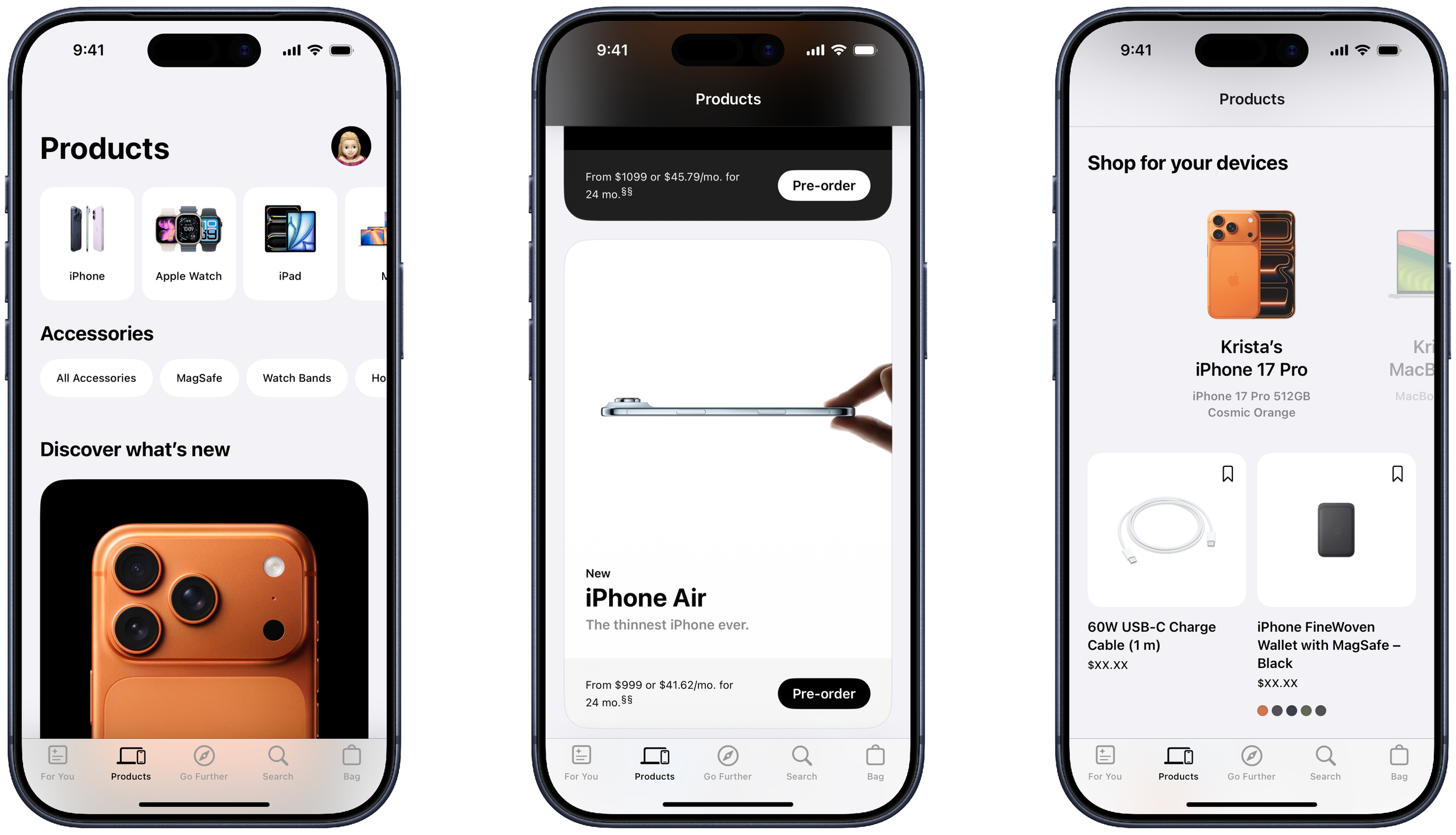
Products Tab
The refreshed Products Tab introduced a new carousel to bring navigating to products to the forefront. A quick swipe through the carousel of product families or accessories created faster access to shopping opportunities. We also redesigned the card system to highlight freshly released products. On scroll, a user can see their latest devices and recommended accessories for quick, compatible purchase ideas.

For You Tab
This tab was redesigned to be a hub for app users to stay up to date on their latest purchases, personalized offers, and app features. In it, we’ve included a “Recent Activity” area to allow quick access to saved items or upcoming sessions reservations. We’ve also included a carousel to feature additional opportunities and services exclusively from Apple.
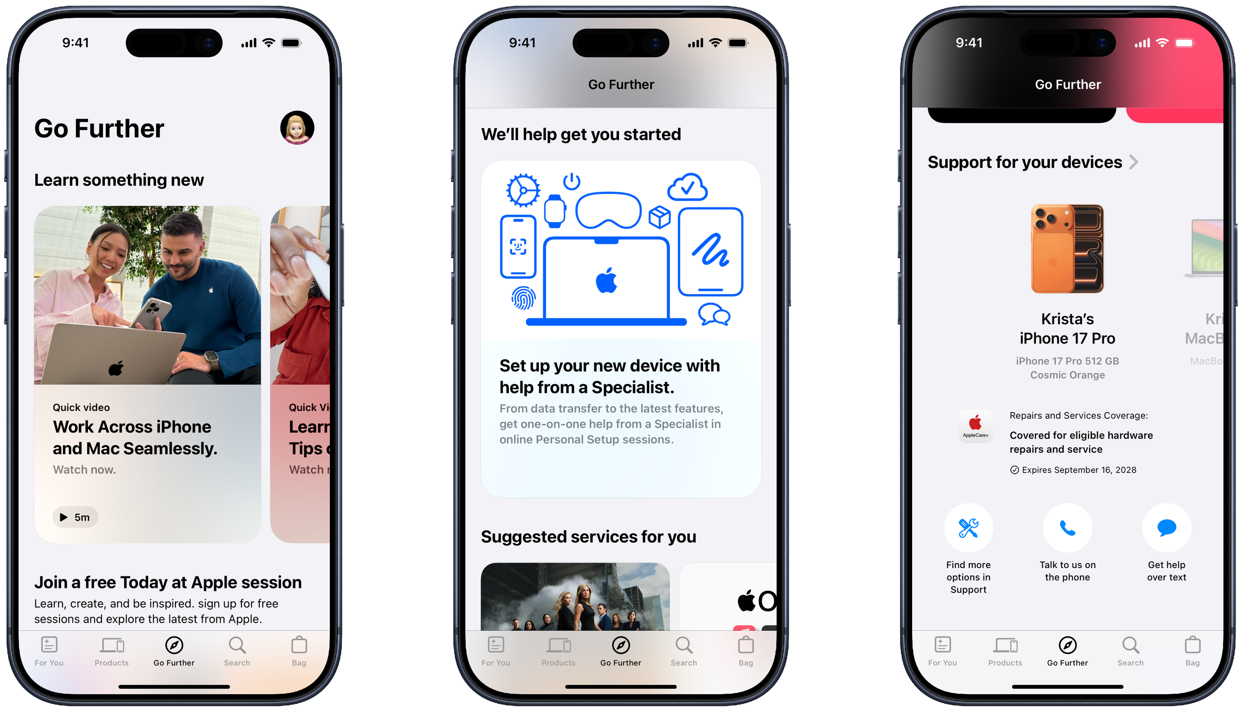
Go Further Tab
This tab was designed to help users discover more ways to connect with their Apple Products. We started with a carousel of quick videos to discover tips and tricks they may not know about their devices, followed with Apple Sessions available for learning at local stores, and finished with options to find support for devices linked to their Apple accounts.
Refinement
When the tab designs were completed, I worked alongside several other designers to make the pages pixel perfect, annotate design variations/behaviors of page elements, and produce templates for other teams to build content for the new system. This work also included building page components out in Sketch Libraries such that they could be recycled in new work throughout the studio. Below is an example of one of the many components we annotated as part of this process.

Annotating Components
Each element within the redesign required detailed spec sheets to communicate the intent of each element to developers. Spacing, color, behavior, and states of elements were all captured to convey the flexibility of each component.
This components system saved time by reducing the amount of comps required to communicate between design and development teams. It also aided future teams, by providing design references that could be reused in creating new elements across the app.
Agency
Huge Inc, via embedded team at Apple
My Role
Sr Designer
Team
Associate Creative Directors: Henrik Karlsson, Oliver Albrecht , Maria Ho
Project Mangers: Jen Odenheimer, Jocelyn Kim
Copy: Robin Dafforn
UX: Jae Won Chan, Kostas Vainas
Art Director: David Kreie, Erica Dang
Designers: Ali Mortenson, Jonathan Park, Kris Gross, Monica Varriale, Willie Honig